
Hello everyone! Welcome to the final blog in the Latest Power BI Desktop Feature Updates Blog Series brought to you by Dock 365!
In case you missed out on Part I and Part II of the series, please click below to read:
Blog-Series: Latest Power BI Desktop Feature Updates - Part I
Blog-Series: Latest Power BI Desktop Feature Updates - Part II
Let’s explore exciting custom visuals updates!
Custom visuals
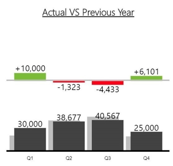
3AG Systems - Column Chart with Variance
- Utilize Column Chart with Variance to showcase and compare actual, forecast, planned, and previous year data with ease.
- It allows you to generate an overlapping column chart using two datasets to display two datasets with a variance chart situated directly above
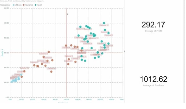
Scatter Chart by Akvelon
- View and compare different metrics with the x and y-axes coordinates, saturation and point size using the Scatter Chart custom visual by Akvelon
- Cross-highlight other visuals on your report page with rectangular selection
- The visual offers a wide gamut of formatting options and supports drilling, constant lines on both axes.
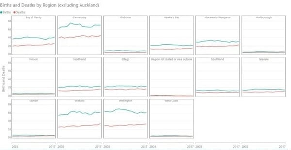
Small Multiples Line Chart
- With Small Multiples Line Chart by Daniel Marsh-Patrick you can use the same scale and axes to display multiple line charts across the values of a category.
- Users can easily compare trends and control the number of multiples per row, labels and even the background shading.
Add Natural Language Summaries for BI
- Add narratives that explain key insights pertaining to the data displayed in your report with the Add Natural Language Summaries for BI custom visual by Arria NLG .
- Create your own templates to use in reports or even tweak starter projects with Arria NLG’ Studio. You can incorporate a narrative update based on your report’s filter context.
PS.You will need an Arria NLG Studio account to use the visual
Pivot Slicer
- The Pivot Slicer custom visual offers you much more than the conventional built-in slicers. Based on any combination of numerical data attributes, linked data items and categorical data types, you can pivot the slicer dynamically.
Use cases for the slicer include
- Stack multiple slicers in a single compact visual
- Explore data rankings that result from weighted combinations of numerical attributes
- Navigate link structure of item hierarchies and networks
- Easily compare attribute values, link weights and linked items by pining items in any view
Well that’s all for today. Hope you had a great time reading our blog series. To know more about Power BI or a customizable SharePoint intranet portal aka Dock 365 for your organization, get in touch with our experts today!
Click below for a Free Demo!

Book a Live demo
Schedule a live demo of Dock 365's Contract Management Software now.