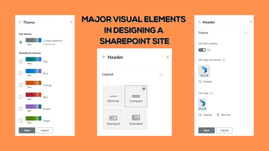
SharePoint Sites are a great option to create separate places for your teams to collaborate, keep documents, and organize data efficiently. Over the years, Microsoft SharePoint got enhanced with stunning customization options, which allows users to make their SharePoint Sites branded and customized to meet their needs. Site headers are very significant when it comes to setting up the right impact and expression of your brand. In this blog, we will tell you how to design SharePoint Sites with simple yet significant headers. This blog will let you capable of generating better SharePoint design ideas.
With increased demand and requests for advanced header options and other configuration facilities to further customize the SharePoint Sites, Microsoft has provided a handful of new updates to configure SharePoint Site Headers more expressively. Along with 2 new site header layouts, there are also other configuration options provided. These new options are made available to give you more control over the SharePoint Site and its header. Each type of header layout can be used for different scenarios and combining these header layouts and other configuration options well allows you to generate great SharePoint Sites. Do you know how to design a SharePoint site? If yes, you need to know about the latest options and updates too.
Let’s talk more about it here.
Factors You Need to Consider for Designing Your Site Strikingly
You will find a long list of items or factors that can be added to the site or can be configured to make the site look and work better. You can highlight the brand elements or even minimize the branding elements by using these options effectively. Picking the right combination of layouts and related options is important to make the most of these features.
Here are some of the major factors you need to consider for making your SharePoint Site striking:
- Site logo
- Theme
- Footer
- Site header

You can create your own SharePoint design templates using webparts and other customization options provided in the platform.
Potential Items You Can Add in A SharePoint Site Header
Before trying to design a perfect header that showcases your brand well, it is important to understand what information you can include in your SharePoint Site headers to make them ideal.
- The site logo is the first element in the list. This logo can be large which can be non-square and transparent according to the design uploaded.
- Site logo thumbnail and Site title are other elements, which are required in all SharePoint Sites.
- An extended layout site logo is required if you are choosing the extended header layout. The extended layout background image is another element that goes with this header layout.
- For communication sites, you get the option Horizontal Site Navigation to configure, whereas, for Team Sites, you can make use of the Vertical Site Navigation/Quick Launch.
- You will also get access to 4 types of site labels as Site classification, Sensitivity Labels, Information Barriers, and Privacy Settings.
- Using the Following option, you can configure an indicator in the header, which shows whether the user is following the site or not.
- Share, Membership, and Multilingual Picker/Language are other important features.
What are the Common Header Elements
As you know, each header layout can be made exceptional by adding appropriate elements to it. By choosing the appropriate elements, you can justify the intent or content management requirement of the site.
Necessary configurations can be made from the ‘Change the look’ panel which can be accessed by clicking on the settings icon at the top. From there you can set up the site logo, site title, and site logo thumbnail.
What are the Site Header Layout Options Available
You can choose from four types of Site header layouts.
Minimal Header
As the name implies, it is the smallest header layout available. This layout is ideal when you want to drive focus to the content and information in the site more than anything else.
Compact Header
This header layout is larger than the minimal header layout and comes with enough space for all essential information. Thus, this layout is ideal for Team sites and Communication sites.
Standard Header
Unlike the compact header layout with a single line of content in the header, the standard header layout comes with multiple lines of text in the header. If your site comes with larger space availability, this layout can be opted.
Extended Header
The extended header layout has the largest space in the header among the four. It also provides an additional area for background image or color. This makes the layout ideal for SharePoint Sites that want to create an impact by showcasing a brand or concept. You can make the most of this option by applying brand patterns, photographs that represent your brand better, or through custom made brand illustrations. This will be a fantastic choice to try some innovative SharePoint design ideas.
Keep these points in mind and make a big impact by using these options to configure your SharePoint Site headers exceptionally. Learn how to design a SharePoint site and utilize these options.
Book a Live demo
Schedule a live demo of Dock 365's Contract Management Software now.

Written by Alex K Joseph
Alex Joseph is a Digital Marketing Strategist with explicit knowledge in Content Marketing and Microsoft Technologies. A writer by day, Alex is a night owl and a DIYer. Alex's theory is to make businesses achieve success with modern solutions and smart exploitation of resources.


